
Movie poster designs are masterful demonstrations of branding. From the title to the graphics to the color palette — everything about a movie poster is carefully crafted to send a specific message. This is branding at its heart.
Movie posters are often one of the first pieces of marketing collateral you see for an upcoming movie. Months before the release, a poster is hung at the local theater and we start wondering about the big screen experience to come. The power of a poster depends on how well it stirs anticipation. Like any piece of marketing, the poster is only successful if it sends the right message; otherwise it’s just a pretty picture.
Josh and I sat on the couch in our home office and chatted about our favorite movie poster designs from the last twelve months. To keep our evaluation focused, we asked ourselves three questions.
1. What do you like about the design?
2. What message does the poster communicate?
3. What movie experience is this poster selling?
Disclaimer: Kettle Fire Creative does not take credit for any of the following movie poster designs nor endorse any of the films mentioned. We haven’t even seen a lot of them. We just liked their posters.
The Lobster
released Oct. 16, 2015, by a24 films

Thoughts on the movie poster design
The negative space is the immediate attention-getter in this poster design. It’s an original use of an old concept. The design is so beautifully simple that it catches your eye, especially when you realize that’s Colin Farrell peaking out from behind those bookish glasses and dated mustache. The typeface is equally simple, but the pairing of that image with such an odd title gets you thinking.
Thoughts on the messaging
The simplicity, the layout, and the limited color palette work together to create a distinctly indie vibe. The poster doesn’t read comedy, more drama and loss. The fact that Farrell is hugging an invisible woman makes it pretty clear something is missing from his life. The edgy artwork leads one to believe the film will be equally experimental, as this movie poster design fits a more progressive artistic sort of performance.
Key selling point
Come see a not-hot Colin Farrell in a quirky thought-provoking drama.
The Martian
released Oct. 2, 2015, by 20th Century Fox

Thoughts on the movie poster design
The composition here is pretty flawless. The focal point is centered so the circular graphic around his face feels natural. Artistically, Josh appreciated the movement from photorealism to abstraction. The tracking, the space between the letters, balances the short title with the rest of the design. The outer space element is clear but not over stated.
Thoughts on the messaging
Matt Damon is isolated in the image. Combine that with the tagline “Bring him home” and you can assume there will be a lot of scenes featuring just Damon. Also, the streaky texture evokes a sensory response so we assume the film will have some sensory elements to it. We’re talking about interacting with the physical universe, and it’s a space movie, so obviously there are going to be some interesting obstacles or challenges rising from physicality. And the color story clearly says Mars without being a giant red poster.
Key selling point
Come see Matt Damon battle the elements while stranded on Mars.
Urge
released June 3, 2016, by Grindstone Entertainment

Thoughts on the movie poster design
First off, we knew nothing about this movie when we saw the poster, so you know we’re truly dissecting the design, not just regurgitating what we saw in a trailer or the film itself.
There’s a strong verticality to this design that made Josh think that Pierce Bronsnan’s character has a high rank or a position of power. Then we have this weaving of characters into the word URGE like maybe they’re all wrapped up in a principle character’s issues or like every individual character is dealing with some kind of desire. The directional lines made us think the characters will probably be pulled apart at some point. And the color story screams trendy nightclub.
Thoughts on the messaging
I would bet that this is a dark movie, meaning it’ll take place almost entirely at night. Brosnan’s styling, with the hair, suit, and cigar, tells us he’s some powerful bad guy. Also of note, he’s listed at the end of the cast as the “and” actor. (Yes, the way the names are displayed and ordered totally counts as part of the movie poster design and messaging.) So, though he’s towering over the others on the poster, he won’t have the most screen time. Finally, the tagline “Every high has its price” tells us there’ll be some illicit behavior.
Key selling point
Come see Pierce Brosnan play an edgy antagonist who pulls hot twenty-somethings into his web.
In the Heart of the Sea
released Dec. 12, 2015, by Imagine Entertainment

Thoughts on the movie poster design
This might be my favorite poster on this list and we never even saw the movie. It’s unexpected. Neither of us could think of any other movie poster with this concept. The major design elements at play here are texture and scale. Also, you should consider that chances are no one photographed this moment. This is pure digital art at its most realistic and impressive.
Thoughts on the messaging
This poster makes me anxious and I think that’s the intended reaction. The areal perspective is disorienting because it’s not how we normally view the world. And the whale is so big compared to that poor little sailboat! The poised typeface keeps this from looking like a cheap summer thriller. Finally, and so obvious we almost didn’t think of it, the giant white whale triggers instant associations with Moby Dick. The fact that we can’t see a single face or person in this poster tells the former English teacher in me that the central conflict will be man vs. nature not man vs. man.
Key selling point
Come see a high-tension, edge-of-your-seat adventure in a very wet setting.
Nerve
released July 27, 2016, by Lionsgate

Thoughts on the movie poster design
Again, we see the neon nightclub color story that’s been very popular this year. The layering of the couple, the glass, the rain, and the lens flare has a cool effect on the perspective of the poster, especially when you add the techy text on top. Is the whole image supposed to look like it’s on a screen?
Thoughts on the messaging
The picture is somewhat voyeuristic, which tells us something odd is going on here. This isn’t about a romance. Although there’s an intimate moment happening, all the other design elements combine to tell you that something is twisted about the situation. Something is unsettling under the surface here and it most likely involves technology.
Key selling point
Come escape reality in an adrenaline inducing teen thriller.
Patriots Day

Thoughts on the movie poster design
Shoelaces are a pretty uncommon medium. The uneven strands create a tattered American flag. Red, white, and blue pop against the black background. The distressed letters contribute the broken vibe, and the high-contrast white on black suggests major conflict.
Thoughts on the messaging
This is going to be a rough story, Josh thought. Something not so sweet and lovely is going to happen to these characters. Having no idea the film is about the search for the perpetrators of the Boston Marathon Bombing, Josh said, “Perhaps we’re saying something about the unsightliness of some sort of history in the U.S.” and “Sports seems to be a major theme here with the shoelaces, but why are these actors in a sports movie? It doesn’t make sense. It’s gotta be somewhat dark. With the distressed text, the real focus isn’t going to be on the sports.” The guy is on point.
Key selling point
Come see an A-list cast in a gritty drama involving athletic activity and U.S. history.
Zoom
released in the U.S. on Sept. 2, 2016, by Elevation Pictures

Thoughts on the movie poster design
Halftone is when you use dots to simulate gradients without changing ink color. It’s typically associated with comic books and pop art, and that’s the focus here. The clear dividing line plays up the contrast between the photo and the illustration. The yellow dotted title further emphasizes the comic book connection.
Thoughts on the messaging
We’re probably looking at two worlds here or at least multiple perspectives. Josh thought the woman’s pink hair and chunky blue glasses made her look “like someone who could have an imaginary boyfriend.” I’m not sure I agree on that one. The festival awards with Gael García Bernal starring tell us the film will be just as artsy and surreal as the poster.
Key selling point
Come see an imaginative character-driven art house film.
The Girl on the Train
will be released Oct. 17, 2016, by Universal Pictures
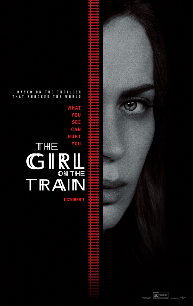
Thoughts on the movie poster design
The typography is the real story here. You’re seeing the letters from multiple angles simultaneously, sort of like double vision. It’s not an even shift of the overlapping letters, but a custom adjustment to show one set remaining stationary and one set sliding past. The color palette of red, white, and black is classic mystery.
Thoughts on the messaging
The vertical train tracks reminded of us stitches, which often symbolize a disturbance beneath the surface. Seeing half of Emily Blunt’s lovely face implies mystery, especially as she’s shrouded in darkness. Her eye, which is staring dead ahead despite the angle of her face, tells us she saw something significant. The tagline “What you see can hurt you” backs this up. The commentary “based on the thriller that shocked the world” boldly asserts there will be some major twists and you should be disappointed if you figure out the ending too soon.
Key selling point
Come see Emily Blunt act her heart out in an intense thriller filled with misdirection.
Did we miss any of your favorite designs? What posters have caught your attention this fall? Let us know in the comments.
Fun to read, interesting images.
Thank you, Allen!
This was EXTREMELY fascinating. I will never look at a movie poster the same way ever again. It’s amazing what can be communicated through one image.
Thank you, Bekah! We enjoy letting our inner design and messaging geeks out every now and again.